The Art of Armenian Calligraphy | ՀԱՅԿԱԿԱՆ ԳԵՂԱԳՐՈՒԹՅԱՆ ԱՐՎԵՍՏ | L’Art Calligraphique Armènien
The Art of Calligraphy: Script in its purest forms – on Asbarez and Armenian Weekly
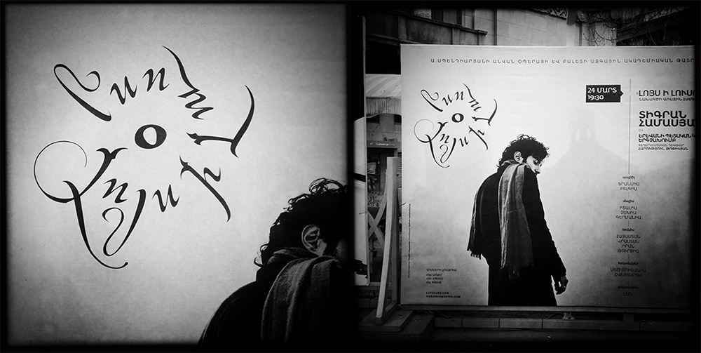
The Art of Armenian Calligraphy
“The Armenians, one of the most ancient nations of the civilized world, have maintained themselves as a cultivated people amidst the revolutions, barbarism, despotism, and war that have recurred in Western Asia from the days of Assyria, Greece, and Rome, to the period of the Mongolian, Turkish and Persian dominion…” ( 1 )
The most stunning examples of Armenian calligraphy lie in the tens of thousands of manuscripts that have been preserved to this day. As works of art, these manuscripts have inspired a period of scientific and philosophical learning for a number of academic (philological and linguistic) communities, and are themselves living cultural remnants of exceptional aesthetic value. Over 30,000 manuscripts survived the devastation wrought upon the Armenian nation by continuous invasions of Arabs, Mongols and Ottoman Turks (e.g., over 10,000 manuscripts were burned by Seljuk Turks in 1070 after a 40-year siege of Kapan, the capital of the Suinik province of the Armenian Bagratuni Kingdom). Today parts of collections are housed at libraries and museums in Vienna, Jerusalem, Venice (San Lazzaro Island), New Julfa, Paris, London and Los Angeles. The largest collection by far is that housed at the Matenadaran (Մատենադարան ) in Yerevan, Armenia, with more than 17,000 manuscripts in total. The oldest surviving complete Armenian manuscript is the Mlk’é Gospel of 862 at San Lazzaro.
Archaeological digs of the last decades on the territory of the Armenian Plateau show signs of a developed a culture capable of building temples and using agriculture around 12-7th millennium B.C., – making it one of the oldest inhabited parts of the world. Armenians pride themselves on being the first nation formally to adopt Christianity as its state religion (301 A.D.), the consequences of which played a decisive role in the formation of an Armenian spiritual culture and the birth of the national alphabet and literacy.
Invented in the year 405 A.D. by St. Mesrop Mashtots and designed with the help of scribe Rophanos, the creation of the Armenian alphabet was a pivotal moment in the history of the Armenian nation. Fifth century Armenia became the location of ceaseless confrontations between Byzantium and Persia and the invention of the new alphabet prevented assimilation into the linguistic dominance of one of the neighboring empires, establishing a true national identity based on an innate substance.
The alphabet of Mashtots’ was so lucid and easily learnt as to become current, widely and instantaneously, across the social and economic boundaries of Armenian society in the fifth century: soldiers scribbled it on papyri, pilgrims scratched it on rocks. It immediately evolved cursive forms. It became permanently inseparable from the essential components of Armenian identity: Armenian was never again to be written otherwise, and even Armenians who spoke alien tongues used their own script to write in them. The overall effect was at least as galvanizing and dramatic as the outcome of the mass literacy campaigns of modern revolutionary societies. ( 2 )
Prior to this, documents were written in Greek, Syriac and Aramaic – scripts which Mashtots studied extensively as possible source models for the Armenian writing system during his travels across Asia Minor, Egypt and Sinai. One-to-one correspondence between sounds, letters and order constitutes a similarity with the Greek alphabet and displays an apparent intention of orienting Armenians westward. Thus the aesthetics of Angular Erkata’gir resemble graceful Greek and Roman inscriptions: letters are large, erect and clearly separated. Interestingly, according to the biography of Mashtots, Koriun, a pupil of Mashtots, carefully avoided giving total credit to Mashtots for creating the script. In fact, Koriun avoids using the word “creation” or “invention” anywhere in his account, referring to Mashtots as a ‘translator’ who was “looking for a thing” that was “found” in Edessa where Mashtots received his “divine” vision inspiring the new alphabet.
Despite the controversy surrounding its origins, the Armenian alphabet is a remarkable achievement; its adoption began a period of illumination and intellectual expression unparalleled in Armenian history. It allowed Armenians to translate into their own language the works of Christian theology and of Greek, Latin, Persian and Arabic classical literature. In fact, a number of these works have been preserved only through their Armenian translations. The new alphabet created conditions for the development of scholarly institutions and a distinct body of literature, profoundly transforming the cultural image and the spiritual atmosphere of the country.
The Alphabet
Paleographers have proposed different views on the roots of the Armenian alphabet, some citing Phoenician, Assyro-Babylonian, Hittite and Greek origins. It is the latter theory which is universally accepted – the base script for 24 letters which Mashtots completed and adopted is Greek. They are identical to Greek in their phonetic value and their almost entirely preserved order, but the Armenian language is more complex and required an additional 14 letters for correct phonetic representation. With these additional 14 letters, the number of Armenian letters reached 36, representing six vowels and thirty consonants. In the following centuries three more characters – և – Օ – ֆ were added, bringing the total number of letters to 39.
The Armenian alphabet reveals a complex system of thought interlinked with mathematics, metaphysics and philosophy. The Armenian word for alphabet is ayb-u-ben (Այբուբեն), named after the first two letters of the Armenian alphabet. It is composed as a prayer, beginning with Ա – Astvats (=God) and ending with Ք – K’ristos (=Christ). Numbers are represented by letters and since Mashtots had to determine for himself the order of the letters in his alphabet after the first, classical 22, those ordinal numbers and their corresponding letters, in particular, reflect their inventor’s knowledge of esoterica and his intentions ( 3 ). Among the first words and sentences written in the Armenian alphabet by Mesrop Mashtots were: “To know wisdom and gain instruction; to discern the words of understanding…”
The calligraphic tools
Until the introduction of paper in the tenth century, the common writing material was parchment. For some of the better-preserved manuscripts, the parchment was of an exceptional quality, allowing the ink to retain most of its density until the present day; it was thin and soft as paper, bright, sometimes simply white. There was naturally a variety of parchment in common use at this time, ranging from thick pieces of varying quality in the early years, to these aforementioned higher quality specimens; much of this was of course a function of the wealth of the supporting patron or monastery for which a piece of work was commissioned. The quality of parchment was affected by whether it was well treated on both sides or not. It was made from the skin of domestic animals, with the most appreciated pieces takn from the skin of a lamb or a dead-born animal. Especially refined parchments (vellums) were used in Cilician Armenia and were most likely imported from Western Europe and the Crusader’s Kingdoms. The earliest dated Armenian handwritten manuscript on paper (Matenadaran No 2679) was created in 981 by the priest Davit and his son, calligrapher Gukas.
Calligraphy was a well-established practice in medieval Armenia, with a calligrapher typically in possession of a wide assembly of tools. Early writing tools were made of metal, which were later replaced by reed pens – “kalam”. Quill pens were used as well. The perfected tool became the pen-and-ink bottle, which made the action of dipping the pen in ink obsolete.
Many early Armenian manuscripts employed brown ink containing an iron oxide rather than the dark black of an Indian or Chinese ink. The inks were tested on marble plates and were prepared in containers made from clams. There were virtually hundreds of recipes for ink, prepared chemically or from natural pigments and minerals. Apart from basic components such as clay and metal, egg yolk and honey, other natural elements were used. Water was used to mix the ink and by the end of the process, gold, silver or wax polish was often applied to the surface. Black and red colors were most frequently in use, along with some usage of brown, green and blue, which were famous for their quality across Europe and the East. Arab writers and calligraphers often used and praised Armenian colors, especially “vordan karmir – որդան կարմիր” known in Europe as “Porphyrophora hamelii” or “Armenian red”, and in the Arab world as “kirmiz” – a deep crimson dye (RGB 220, 20, 60) extracted from an insect (Pseudococcus) common to the Ararat Valley.
The Script
The traditionally accepted theory is of Mesropean script’s linear evolution, although a thesis that most script types except Sła’gir (modern cursive) were in use from early on, perhaps even from the start, seems to be gaining ground. That we have few examples of later scripts used in the early manuscripts might be simply a result of loss over time. Two of Matenadaran’s collection manuscripts’ colophons – MS2877 and MS2684 (1159) are written in Sła’gir and belong to the eleventh to twelfth centuries ( 4 ). This script is thought to have been used exclusively only in the late XIX century, some 700 year later.
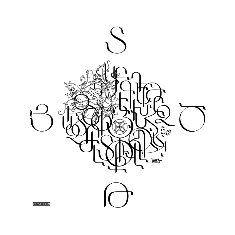
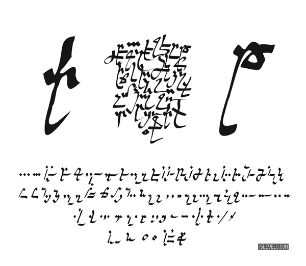
Script Classification
Armenian script styles are neither neat nor clean cut. The use of one type with another is common. Erkata’gir (Երկատազիր) The script is monumental by style, majuscule, the letters are large, very erect, with gracefully rounded lines connecting the vertical elements of the letters or springing from them. All the letters of the Erkata’gir script were written on the base line between two imaginary parallel lines, with ascending and descending elements being only slightly extended with the exception of two letters whose elements extend more drastically. Across the range of manuscripts, up to 10 varieties of this script are observable. 5 Round Erkata’gir is characterized by a contrast between thick vertical forms and razor-thin connecting curved strokes. The proportion of height to width is typically 5:3, 4:3, 3:2. The same proportion is applied to the width of characters and the distances between them. The columns are well defined and characters are clearly separated, which gives the script a more geometrical essence and feeling. Straight Erkata’gir differs by slanting to the right at varying angles. Connecting strokes have more variety and the proportion of height to width is 1:1. Characters are placed more closely than in Round Erkata’gir. The height of letters comprises half of the space between lines. These factors give this particular script a certain dynamism.
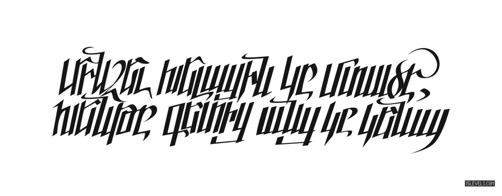
The Bolor’gir (Բոլորգիր) script developed more elegant and graphic forms and although by its definition a round script, the characters are slanted and letters appear to have sharp corners. The contrast between the base shape and the connecting strokes is not as extreme as in Erkata’gir, and it is a more cursive type of script (characters are placed closer to one another), with smaller sizes and altered shapes.
It is a “four line” script with the body of the letters positioned between the baseline and capline with extensions placed between ascending and descending lines that terminate the movement of the hand. The proportion of the script’s height to width is 1:1, 1:1.5, 1:2. Some characters are composed of two elements, therefore doubling their size in width, with the height of the letters including the extension of doubles or triples. There are two varieties of Bolor’gir: the Cilician and the Eastern (Armenia proper), with the former being more articulate and precise, while the latter retains some of the cornerstone elements of Erkata’gir.
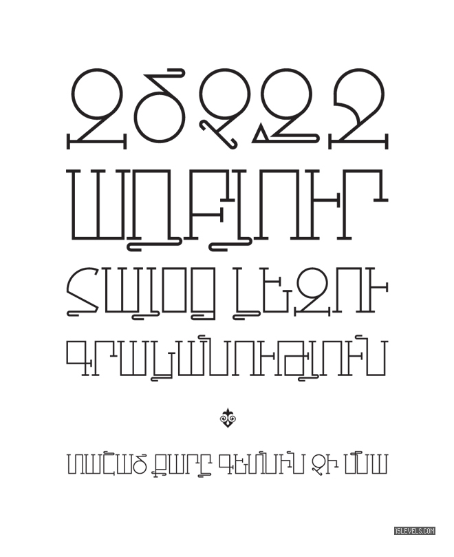
Sła’gir (Շխագիր) cursive script is rarely seen in manuscripts and was used mainly for notes. Executed with reed pens, its main characteristic was that it possessed an equal width of all elements. In general, the shape of the letters recalls that of an irregular Bolor’gir, although some elements of Straight Erkata’gir are in evidence as well. This became the basis for contemporary hand-written scripts in Armenia.
Notr’gir (Նոտրագիր) notary script is a blend of Bolor’gir and Sła’gir with predominant small and cursive forms. It was used in the seventeenth and eighteenth centuries. The secretary working as a scribe (in Latin notarius, in Armenian dpir) at the royal court or the Catholicosate, by necessity employed time-saving cursive versions of Bolor’gir and even smaller Notr’gir letters. The term could have entered Armenian from either late Byzantine Greek or Latin.
Grigor Tatevatzi, a philosopher and painter of the fourteenth century, gave a symbolic and aesthetic interpretation for the relationship between black (dark) text and the white space of the paper. According to his vision, apart from the evident purpose of good visibility and easy comprehension of words, the black color symbolized the pain of original sin, while the white color was a symbol of innocence at birth. The white margins surrounding the text represent the four sides of the cross.
Calligraphy as the birthplace of typography
New BlackSmith Armenian Typeset (WIP)

Modern Methods of Preservation
Today, the transmission of Armenian calligraphy extends well beyond monastic scriptoria and archival repositories. In an age where smartphone applications and online platforms are ubiquitous, the very essence of penmanship is finding new avenues for dissemination. For instance, digital libraries now offer high-resolution scans of medieval manuscripts, while virtual workshops enable novices and enthusiasts alike to practice ancient scripts without ever leaving home. This accessibility underscores the adaptability of Armenian calligraphy—once limited to parchment and reed pens, it now thrives in the infinite space of the internet.
Increasingly, unexpected platforms are also playing a role in expanding the global reach of Armenian cultural expressions. A notable example is the mostbet app download Sri Lanka initiative, where modern design intersects with diverse artistic traditions. While primarily known for its interactive features, such platforms can offer a unique glimpse into local cultures for international audiences. By incorporating visually striking elements—from Armenian-inspired fonts to snippets of calligraphic motifs—these digital spaces can kindle curiosity about one of the world’s oldest script traditions. In turn, such exposure has the potential to draw newcomers toward a deeper appreciation of Armenian heritage and the remarkable artistry behind its calligraphy.
Notes
The text of Script Classification is based on D. Kouymjian ( California State University ) essay from “Album of Armenian Paleography”. It underwent my editing to suit the content of this article, but due credit belongs to the source. I greatfully acknowldege his willingness to allow me to use his research and I am very thankful to J.R.Russell ( Harward University ) and Michael Stone ( HUJI ) for their contributions and inspiration.
Bibliography
- The British Cyclopedia of the Arts, Sciences and History
- J.R. Russell, “On the origins and Invention of the Armenian Script”, Le Museon 1994
- A. Abrahamyan “History of Armenian letters and writing” Erevan 1959
- M. Stone, D. Kouymjian, H. Lehmann “Album of Armenian Paleography”, Aarhus, 2002
- Nerses Akinian “The discovery of the Armenian Alphabet”, Handes Amsorya 52 (1938)
- Dikran Kouymjian “Armeno-Greek Papyrus” (series of articles)
- J.R.Russell “Mashtots’ the Magician” Harvard University
- Simeon Varjapet Phachalean “Haykakan Geghagrutiun” (Armenian calligraphy) (study schoolbook) Nor Nachijevan 1870 (Yerevan Museum of Literature and Art, fond of G. Tchatalbachian No. 426a)
- Yakovbos Tasean (P. Jacobus Dashian) “Overview of Armenian Paleography” 1989 Vienna (Handes Amsorya, 11 (1897) nos. 2-12; 12 (1898), nos. 1-6)
1 The British Cyclopedia of the Arts, Sciences and History. Published by Wm. S. Orr and co., 1838
2 J.R.Russell “Mashtots’ the Magician” Harvard University p. 4
3 J.R.Russell “Mashtots’ the Magician” Harvard University p. 15
4 A. Abrahamyan “History of Armenian letters and writing” Erevan 1959 p. 98
5 D. Kouymjian, “Script Classification,” M. Stone, D. Kouymjian, H. Lehmann, Album of Armenian Paleography, Aarhus, 2002, pp. 63-75]